Preoptima, AI-enabled CO2 calculator
Product Strategy: turning a cutting-edge proof of concept into a market-ready product
Preoptima is a young startup that is building software to assist architects and structural engineers evaluate the CO2 impact of their designs. After assembling a proof-of-concept to demonstrate the technical feasibility of their venture, they reached out to fellow designers and myself to turn it into a market-ready product.
Not a lot of thoughts went into designing the interface of the PoC and you could already see it crack under the weight of the many features the product offered. Also, given the string of new features coming up, the current interface needed a solid upgrade, fast.
Since the product was new, there was almost no prior user knowledge to build upon, a common scenario for disruptive start-ups. The impact on my approach was double: I needed to create this knowledge, at cost and at speed, and I also had to evaluate the scope of the redesign: do I have to redesign the product from the ground up or can I build upon a solid basis? In both cases, the new design needed to be robust enough to accommodate the new features that were already in development in the back end. And of course, resources were scarce, which meant speed was critical.
- Preoptima
- Construction
- Service Design, Product Design
- 3 months
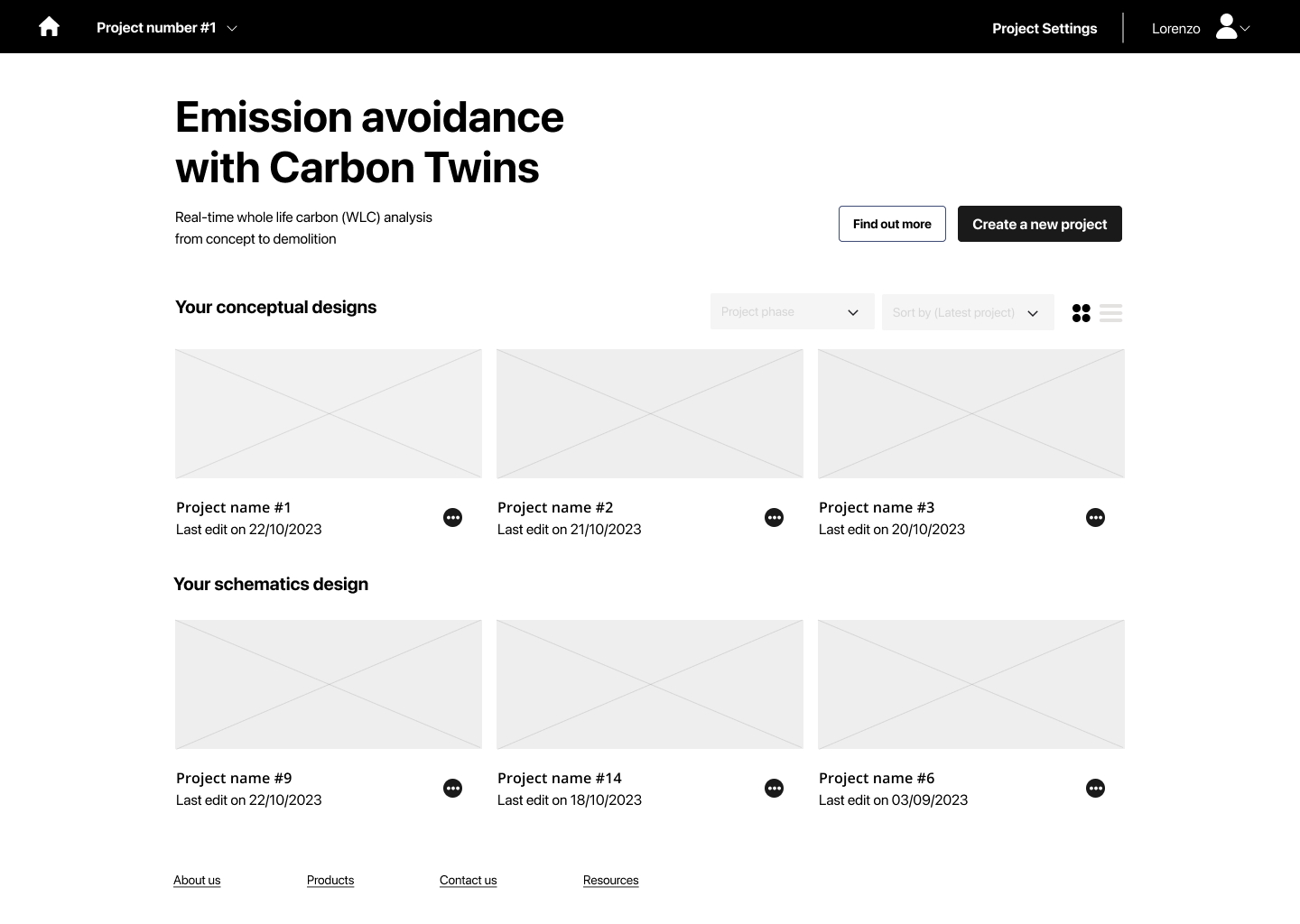
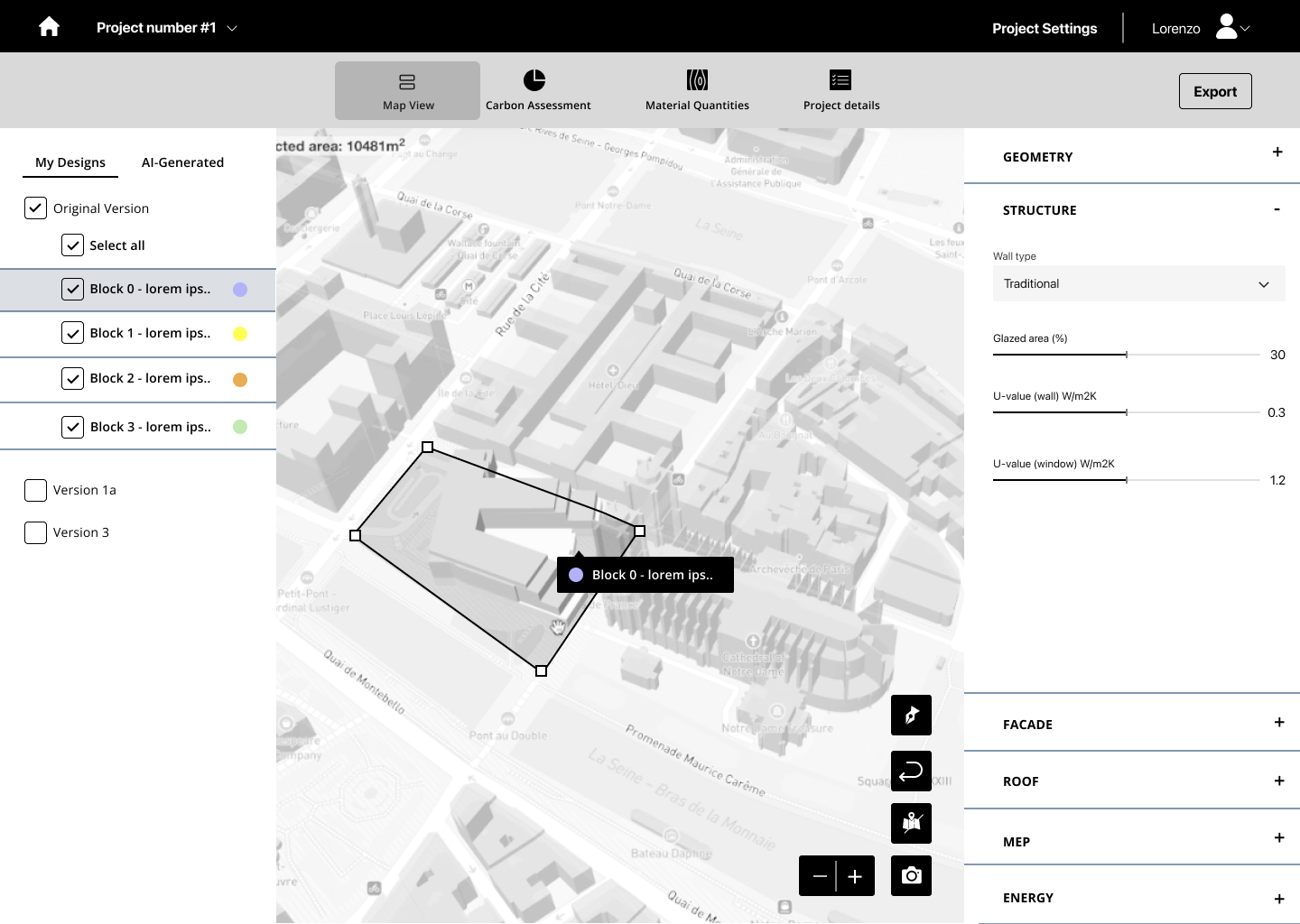
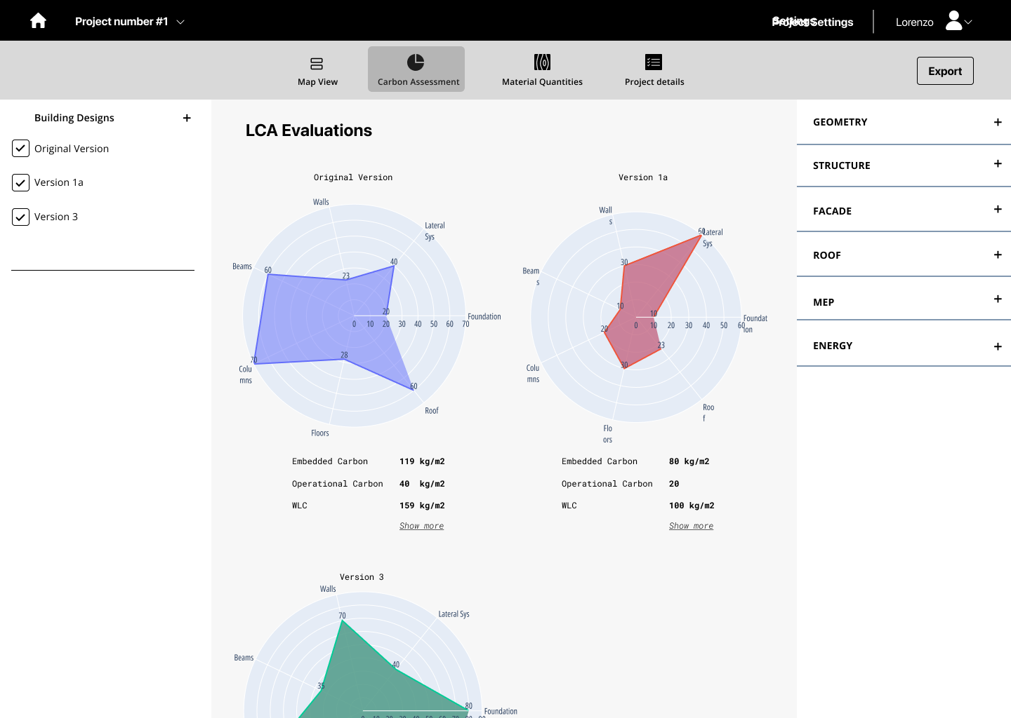
The key: helping users make sense of thousands of design options that the product generate to optimize a project CO2 emissions.
Approach & Team
To respond to the challenge and its constraints, I chose to make sure Preoptima’s product had the solid foundation it needed to grow and flourish. I broke down my process in 5 steps:
1 – Evaluate the scope of the redesign. Through my experience and benchmark of similar products, I evaluated the level of design quality needed for Preoptima to be way above the fold, without sacrificing their speed to market.
2 – Foundation design. After defining what to aim for, I wanted to assess how the critical user flows were served by the current web app. It turned out they were falling short, so I proposed a new information architecture, a new navigation and new user flows – even before thinking about UX.
[user flow visual]
3 – UX design. Testing new foundation fast is easy in digital, and very valuable. I built a series of wireframes to embody my intent and test it with current, engaged customers. Of the few alternatives I proposed, one rapidly gathered confidence and we decided to select it as our main frame of reference.
4 – UI design. In parallel, a senior visual designer was building a new design system, laying out the foundations of a new visual language. Because of speed constraints, we chose to focus on building this system instead of the screens themselves, allowing our client for maximum flexibility while keeping the experience consistent.
To deliver this, I led a team of 2 very senior designers: an experience designer and a senior visual designer.